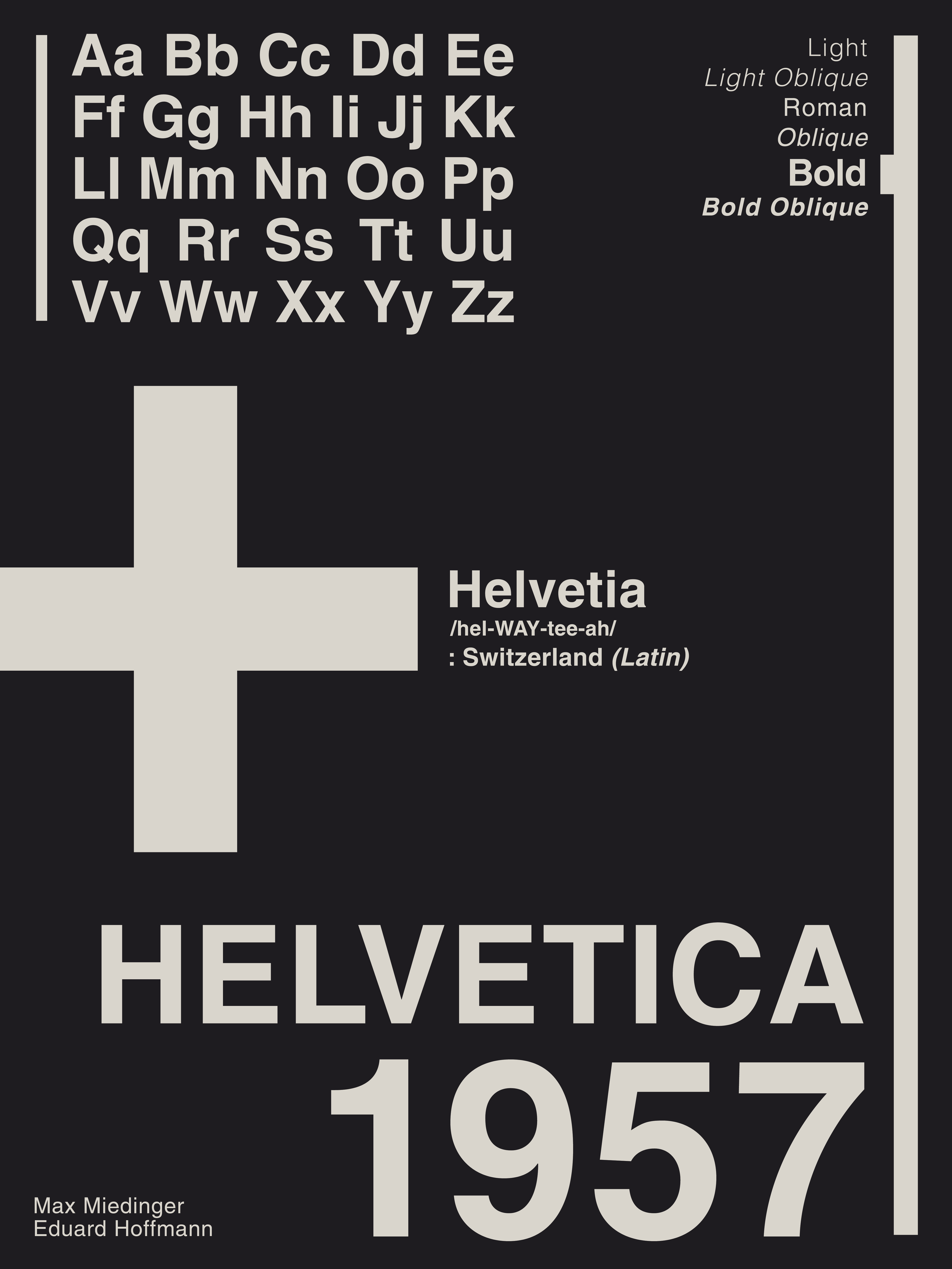
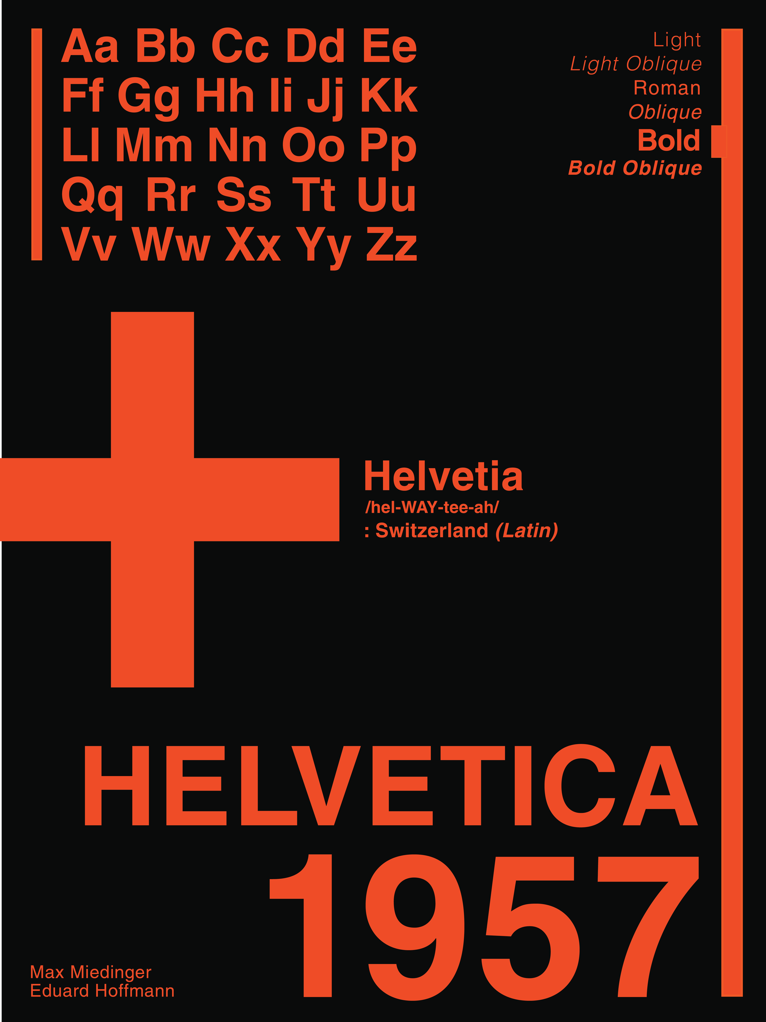
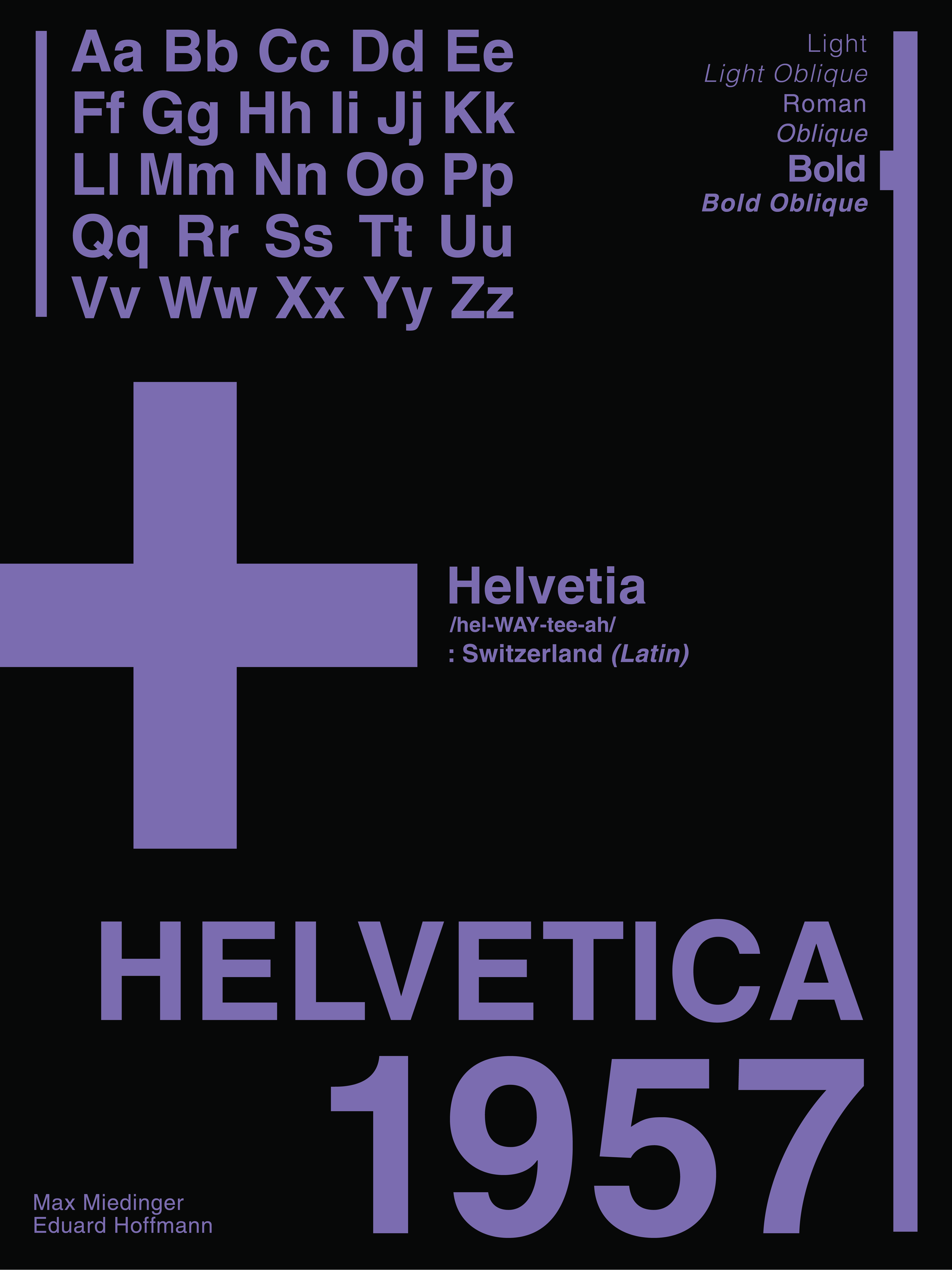
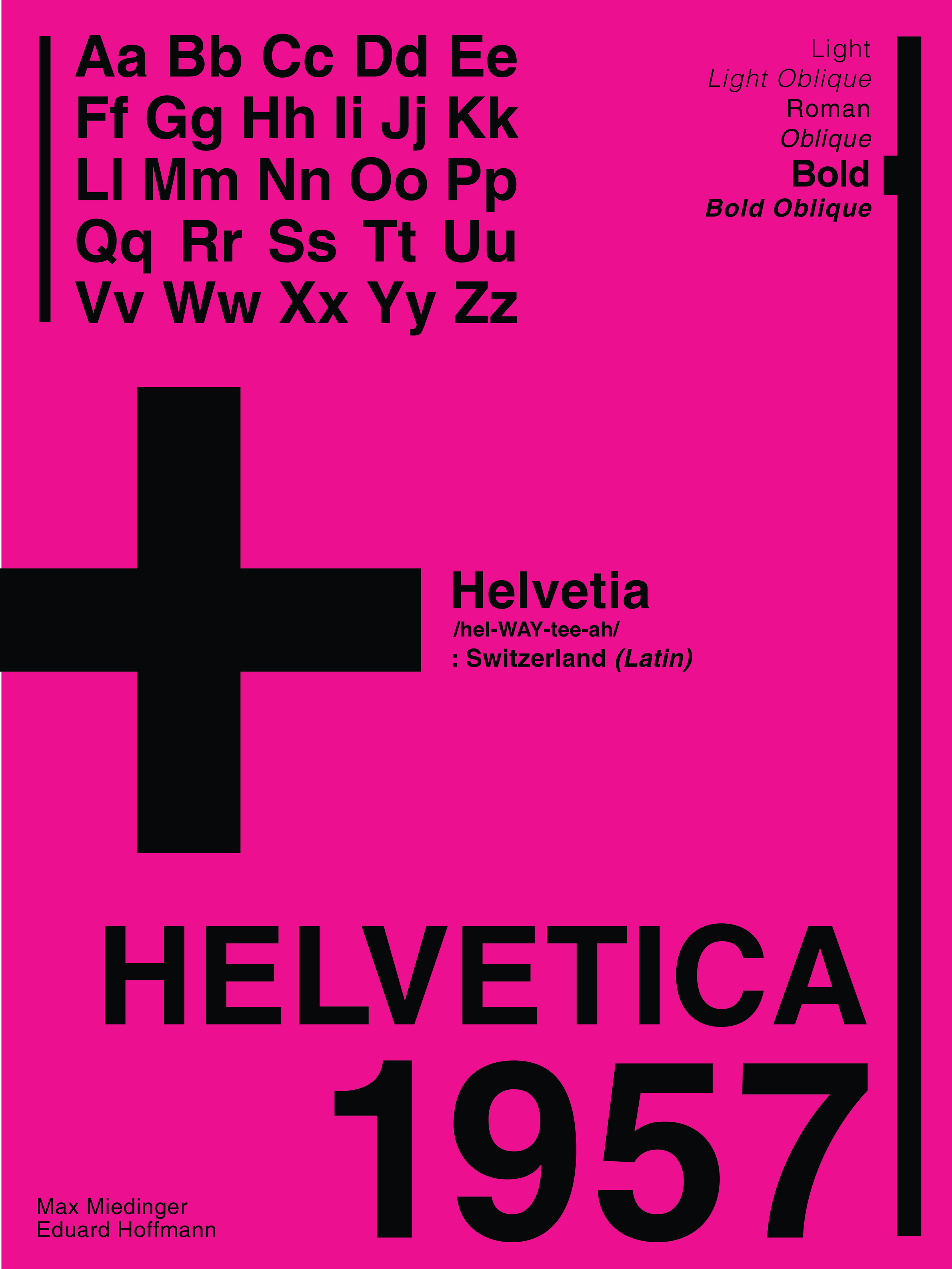
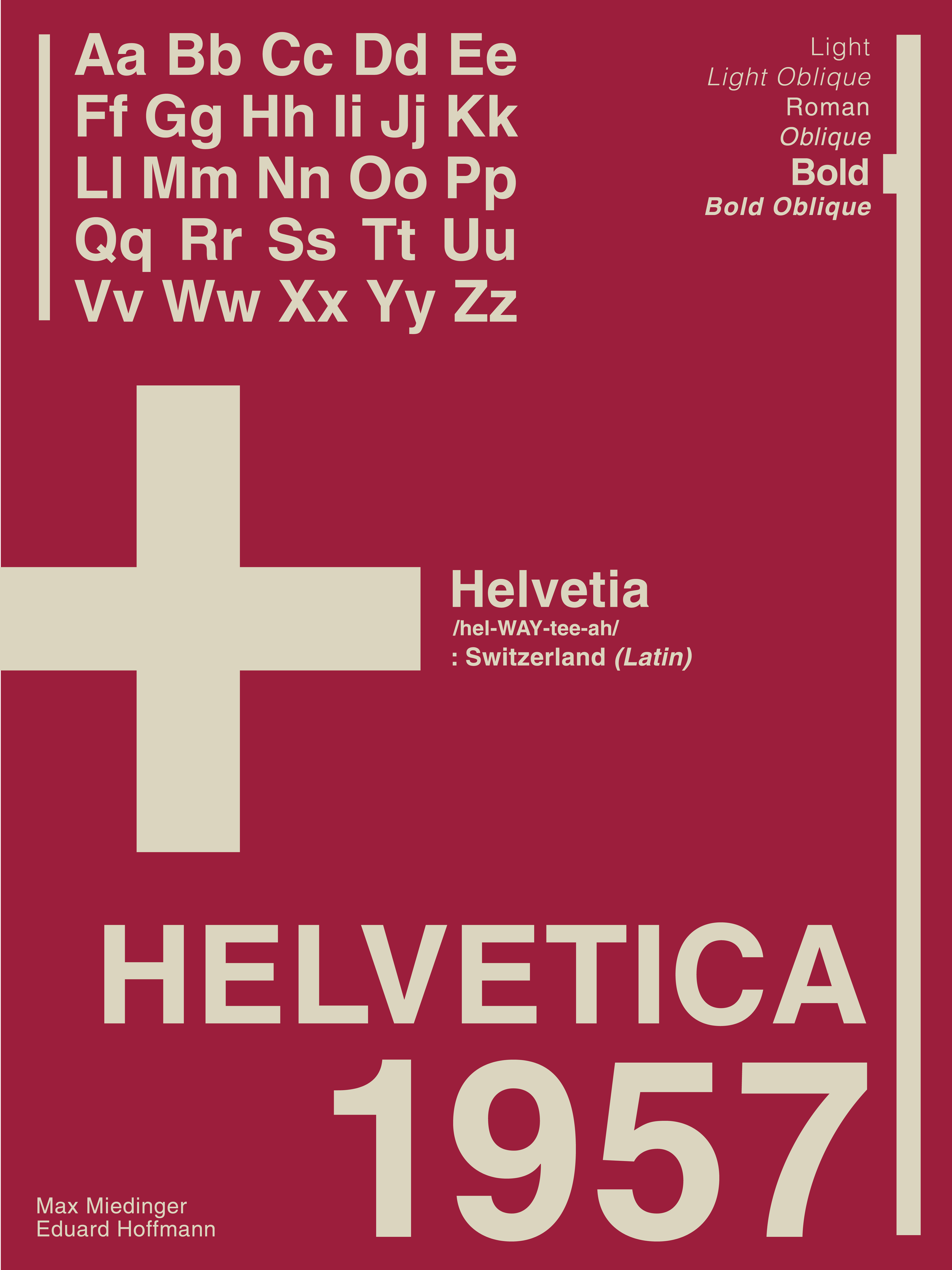
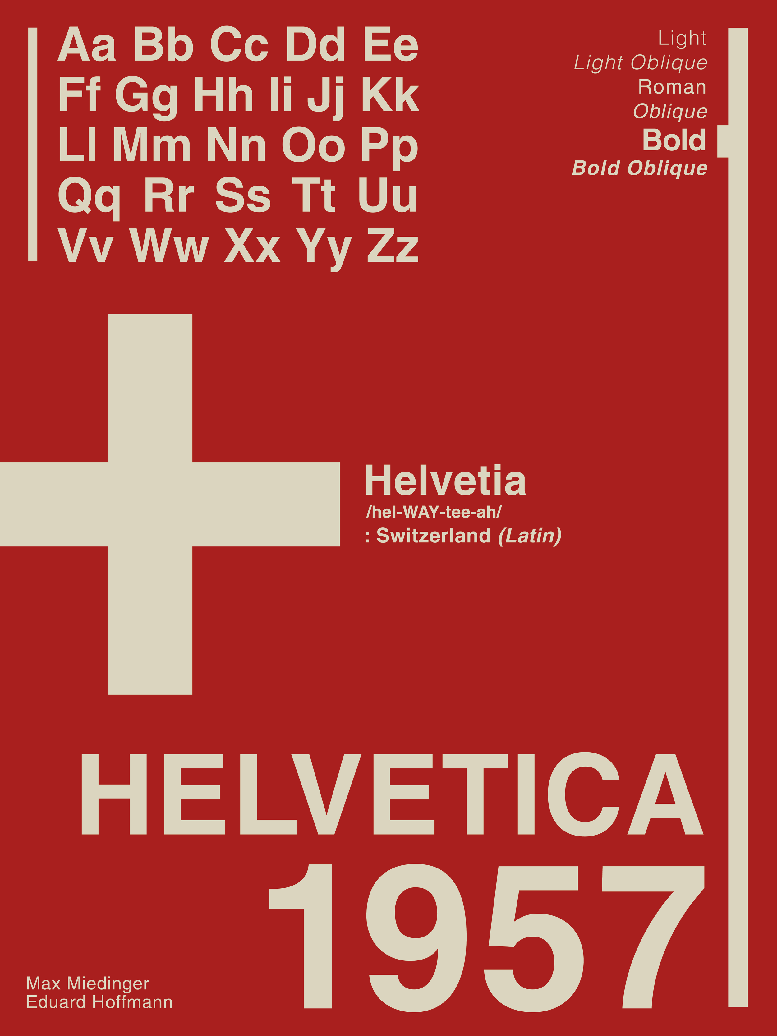
Helvetica began in 1957 as Neue Haas Grotesk, designed with a focus on clarity, neutrality, and the principle that form follows function. In 1960, it was renamed Helvetica, derived from Helvetia, the Latin name for Switzerland, to appeal to an international audience. As a neo-grotesque sans-serif typeface, Helvetica is recognized for its high x-height, dense visual weight, balanced proportions, tight letter spacing, and clean stroke endings. Its evolution continued with Neue Helvetica in 1983, which introduced a more unified system of weights and spacing, and Helvetica Now in 2019, featuring optical sizes designed to improve legibility across different formats and screens. Its influence extends across public infrastructure, corporate branding, and technology, appearing in New York City Subway signage, London Underground signage, NASA Space Shuttle manuals, and branding for companies such as BMW, Lufthansa, Nestlé, Panasonic, and Microsoft. It also became part of early Apple Macintosh systems and remains influential in digital interfaces today. Often compared to typefaces like Arial, Swiss 721, and Nimbus Sans, Helvetica has become an enduring symbol of modernist design, proving that simplicity and functionality can stand the test of time.